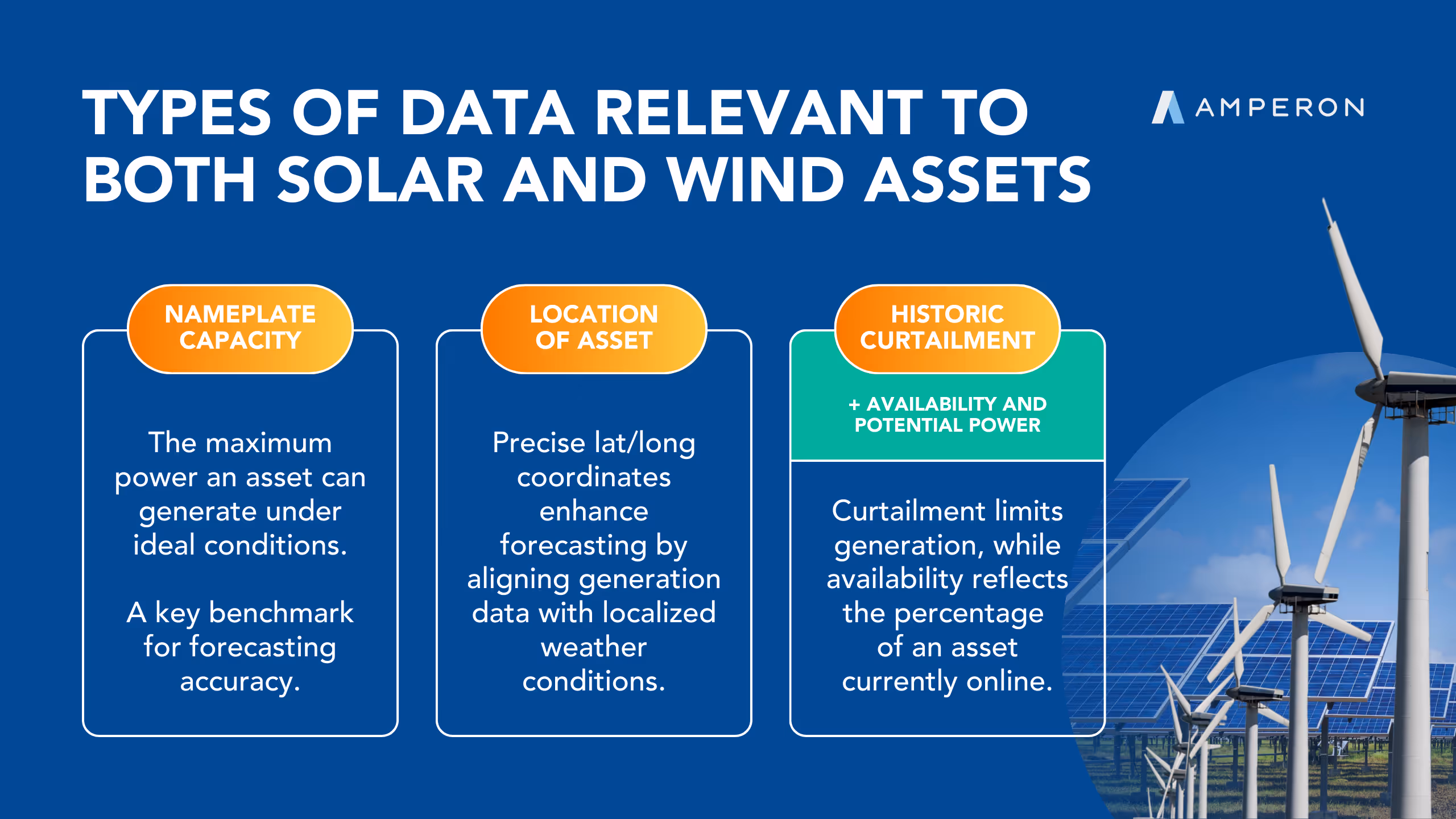
Product Launch
New Product Alert! Grid Demand Mid-Term Forecasting
Learn More

COVID-19 impact on global energy markets

GEERT SCHOLMA
December 8, 2022

Summary

1
2
3
4

OVERVIEW

As of April 13th, 2020, about a third of the worldwide population currently lives in some form of quarantine or curfew1. Many shops have been closed, as well as bars, restaurants, hotels, theatres, schools, offices, museums, libraries, and attractions. This has had a significant attenuating impact on electricity demand, which has been the topic of several articles2345.

The most common type of analysis that has been performed compares historical load ratios either week over week or year over year. However, there are many more factors that need to be taken into account to get an accurate estimation for the impact of lockdowns on regional electricity demand. Historical weather climatology and unadjusted historical load is insufficient to produce a counterfactual estimation of load in the absence of lockdown, as there is significant short-term variability in weather over any given region. As such, models that incorporate either weather actuals or real-time short-term weather forecasts are required. Additionally, for the Northern hemisphere, solar PV production has been increasing over time, which serves as a non-linearity when compared to historical load numbers. In this post, we correct for all these major variables to produce a more accurate estimation of the impact of Covid-19 lockdowns on the electricity demand for 28 regions in Europe, the US and Australia.

METHODOLOGY

We took data for demand and solar PV production from ENTSO-E (Europe)6, NYISO (New York)7, CAISO (California)8, ERCOT (Texas) 9, and AEMO (Australia)10; worldwide temperature data from NOAA11; national public holiday calendars; and combined this with pandemic outbreak numbers from The Johns Hopkins University12, covidtracking.com13, as well as any public information available about lock down dates per country.

From NOAA’s publicly available GHCN weather database, we selected daily average temperatures of about 500 weather stations worldwide. Where available on our internal proprietary operational forecast systems (over Texas and Australia), we used high-resolution weather analysis fields (aka actuals), derived from an ensemble of the HRRR, NAM, ECMWF, and GFS weather models. We then calculated a simple average daily temperature per region, which we fed into the model.

For some plots and analysis we also needed a lockdown date, which we first took from publicly available news feeds. For many regions, these dates didn’t correspond well with the reduction in electricity demand. Many locales took it e.g. upon themselves to begin quarantining before an official government mandate. Also, restrictive measures were taken in several steps, making it difficult to define a single date. The OpenTable datasource (https://www.opentable.com/state-of-industry) was a very valuable guide in determining these “apparent” lockdown dates, as it generally reflects the start dates of de facto lockdowns, but we did not rely on it for all countries as it is not comprehensive enough for our needs. We finally decided to calculate “apparent” lockdown dates as the first date in March 2020 for which the (smoothed) demand reduction percentage increased beyond 2%. For some regions like Italy (locked down on March 9) this date was exactly the same as the official lockdown date, but on average it was half a week earlier and in New York up to 10 days earlier. For the rest of this post, “lockdown” is defined as the apparent lockdown date inferred from the electricity demand reduction and guided by the OpenTable dataset.

We then built a simple linear regression model, trained on 6 months of daily data for January 8 - April 30 2019, and January 8 - February 29 2020, with in total 9 weather and calendar features. We predicted March 1 - April 10 (out of sample, but with actual weather data), as a counterfactual forecast. This allowed us to gain insight into counterfactual forecasts across many regions around the globe to understand what the load would have been in the absence of the pandemic, and the divergence between these counterfactuals and the actual load numbers can reasonably be attributed to the lockdowns.

RESULTS

In the first plot we show an estimation of the maximum weekly reduction of electricity demand per region. The error bars are based on the (normalized mean absolute) error in the model fit, based on the model training up to February 29 2020, indicating the goodness of fit up to that point.

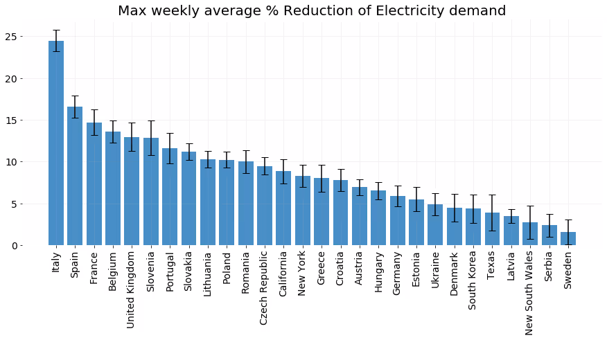
It’s clear that Italy leads the way with almost 25% decrease in electricity demand, followed by Spain at almost 17%. On average an impact of 8.7% with a relatively large standard deviation of 4.9% was found. We can generally correlate the variances with the intensity of the coronavirus outbreak within each region, with higher rates of cases per capita leading to higher rates of demand reduction.

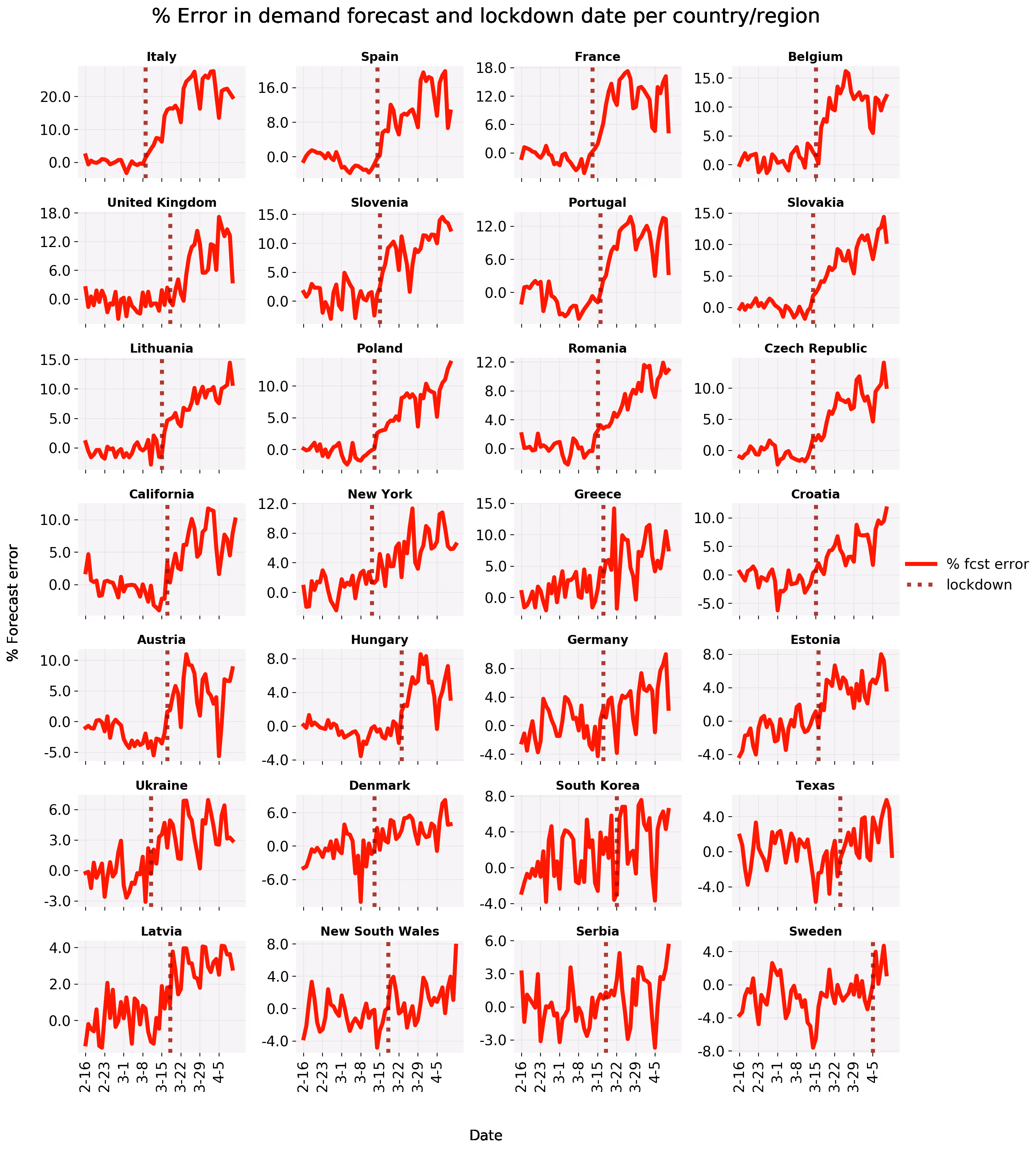
In the second and third plot we show over time the demand actuals and forecast, respectively the percentual forecast error, both annotated with a vertical line for the apparent lockdown date. For some regions the model fit is accurate, demand reduction is sudden and strong, the lockdown date is visually obvious and corresponds with the official lockdown date (Italy). For other regions demand reduction happens more gradually (New York), the fit is noisy (South Korea), a day of week pattern can be spotted (Germany) or you see what happens when a country decides not to lock down (Sweden). Interestingly, for Italy, France, Belgium, Portugal, California and Austria, demand reduction already seems beyond it’s maximum, but we’ll have to wait and see if this is really the case.

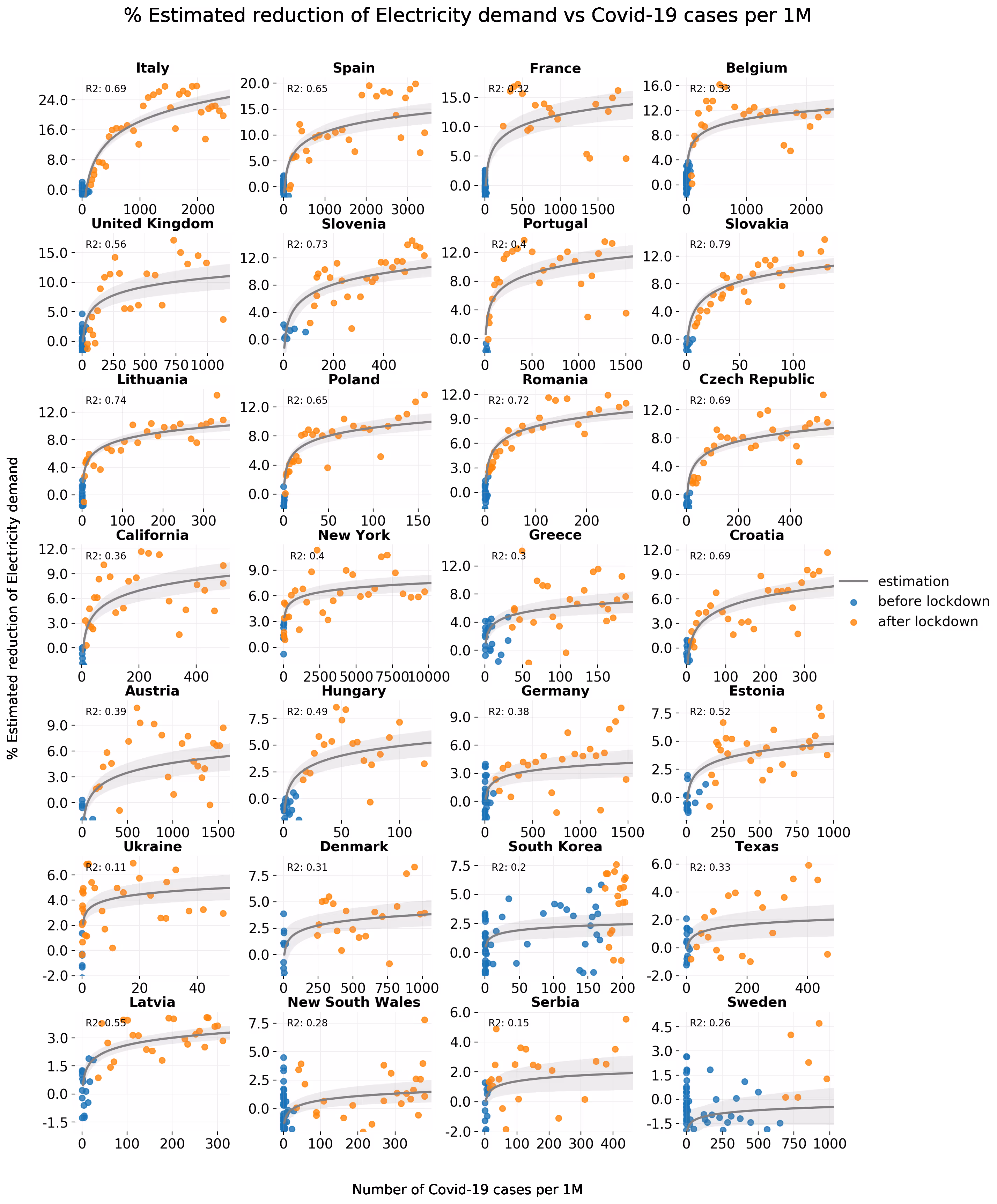
For the fourth plot we combined the estimated electricity demand reduction in a scatterplot with the number of Covid-19 cases before and after lockdown and fitted a logarithmic trend on the data after March 1 2020. Though the logx doesn’t cover a complete or perfect fit, for many regions it captures the relatively steep reduction at the first cases, which then flattens when the outbreak matures.

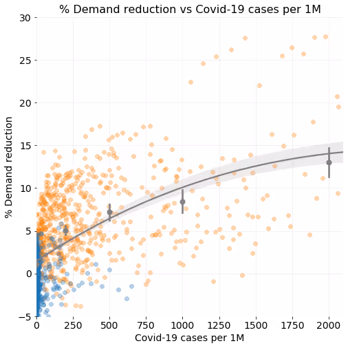
In plot five, aggregating all data from plot 4, we compare the percentage of electricity reduction to the number of Covid-19 cases per 1M population. We aggregated all underlying daily data points also into several bins to expose a clearer view on the average reduction (at 0, 200, 500, 1000 and 2000 cases per 1M). The error bars and band indicate a 95% confidence band of this fit. Roughly speaking, at around 200 per 1M Covid-19 cases you can expect about a 5% demand reduction, increasing towards 10% at 1000 per 1M cases and going towards an average maximum impact of 15% beyond 2000 per 1M cases.

In the sixth plot, for a selection of regions, we show the relationship between the moment of lockdown and the amount of electricity demand reduction, fitted with a (lowess) smoother. Generally, we can see that the more time passes after a lockdown, the more the electricity demand is reduced, which is collinear with the amount of cases in each respective outbreak. We hypothesize that this relationship is actually sigmoidal, as once a full lockdown state is achieved, we should see a stabilization in the demand trend to reflect the new regime. It may be too early to see this relationship for many of the countries below, so it’s worth revisiting this point some weeks from now. According to the smoother the impact for France is already declining for almost two weeks, but this might not hold.

Indicating (again) how much the impact can vary between regions, in the seventh plot we show the data for the two regions in Europe with the highest per 1M Covid-19 numbers (Italy and Spain) and the three regions we investigated in the US (New York, Texas and California). Though towards 3000 per 1M, impacts seem to converge around 15%, around 1500 per 1M cases we could still see a huge spread in demand reduction between 5% and almost 30%, showing regions have reacted very differently under similar situations. As cases all around the world are being measured differently, caution though needs to be taken in the interpretation of the amount of Covid-19 cases.

INSIGHTS FOR REAL-TIME DEMAND FORECASTING

Based on our research, we deployed preemptive measures for our clients on a case-by-case basis as early as March 17th, adjusting predictions to ensure the imbalance is as low as possible even when demand was significantly reduced. This is a difficult task given the completely out-of-sample nature of this phenomenon. Learning from historical load patterns when adjusted for weather conditions is a standard technique in load forecasting, but regime changes in usage like we’re seeing in these lockdowns cannot be learned from prior examples due to a lack of training data.

Even known pattern changes in electricity demand, as seen in Italy and other countries, can not be used “as-is” for grid regions that might be affected by lockdowns in the future, as different flavors of lock-downs were implemented and their effects differ from one place to another. Regional grids also differ wildly in consumption patterns, and it is not possible to simply train a model on one grid’s data and use that model in a new grid region without incurring significant performance impacts.

To solve this, we implemented a fast-learning methodology that can learn from very recent consistent deviations from known patterns. Once such deviations are detected, and found significant by the system, we predict the most likely effect going forward. This is done by resampling past examples and heavily overweighting very recent ones, and learning the magnitude of deviations over time. To test the efficiency of this mechanism, we’ve simulated biases that mimic changes from other grid regions. Running multiple back-tests we’ve found that such methodology can reduce by 70% on average the error that can be attributed to lock-down impacts. Although it’s very appealing to have such a mechanism in place even with no lockdown in sight, we’ve found that false positives can have a slight negative effect on load predictions when no pattern changes occur. Therefore, we monitor the effect of such calibration in each of the regions we service, and make a case-by-case decision when to apply it in each.

We’ve applied this methodology in several models that service territories in AEMO (Australia) and ERCOT (Texas). To date, the system has not detected a significant impact in ERCOT, but from the four AEMO territories we service, we’ve detected large regime shifts in patterns in New South Wales starting the last week of March. The following graph is an example of our predictions with and without this adjustment for that territory for several days in the start of April. We will continue monitoring the situation, making adjustments as needed when the pandemic begins to taper off and updating the models accordingly.

REFERENCES


AI-driven Forecasting

Our advanced machine learning methodology delivers the accuracy you need to optimize operations and maximize profits.

  • 40K weather points from 4 vendors
  • 15-day short-term forecasts that update sub-hourly
  • Globally available
  • Leading UI/UX or API delivery
Book a demo

Want 3x more accurate forecasts? Let's talk.

Book a demo

Related articles

Left arrow icon for navigationRight arrow icon for navigation
Blog
December 5, 2025
The Pacific Northwest Risks a 6 GW Shortfall This Winter
Open article
Blog
December 5, 2025
With Millions On the Line, Amperon Called Cold Snap 33 Days Out
Open article
Blog
December 5, 2025
Chilean Solar and Wind Asset Owners Face Hourly Reporting Under New Market Structure
Open article
Blog
December 5, 2025
Can PJM Keep Up with Exponential Load Growth?
Open article
Blog
December 5, 2025
US Winter Weather Outlook 2025–2026: Mild on Paper, Volatile in Practice
Open article
Blog
December 5, 2025
Ontario’s Day-Ahead Market is a Renewables Profitability Test
Open article
Blog
December 5, 2025
US Solar and Wind Curtailment Is Exploding
Open article
Blog
December 5, 2025
Navigating the RTC+B Paradigm Shift
Open article
Case study banner reading “Nailing MISO’s Fall 2025 Coincident Peak” with a computer displaying grid demand forecasts
Blog
December 5, 2025
Nailing MISO's Fall 2025 Coincident Peak: A Week-Ahead Perfect Call
Open article
Amperon MTF model visualization displaying market trends and forecasts
Blog
December 5, 2025
Unlocking Intelligent Term Trading and Seasonal Planning  
Open article
Blog post header with palm tree in hurricane winds asking Why Has This Hurricane Season Been So Quiet with Amperon branding
Blog
December 5, 2025
Why Has This Hurricane Season Been So Quiet?
Open article
Table showing parallel flow congestion scenarios across different energy markets including ISO/RTO, WEIM, WEIS, Markets+, and EDAM with scheduled delivery systems and mitigation strategies
Blog
December 5, 2025
CAISO Breaks the Transmission Hedge
Open article
Amperon blog post graphic asking High ERCOT Demand, Low Wind, and No Price Spike? with load forecast chart for August 18, 2025
Blog
December 5, 2025
High ERCOT Demand, Low Wind, and No Price Spike?
Open article
ISONE May hourly average load comparison chart showing data from 2023, 2024, and 2025 with peak loads around 13,534 MW at HE17-18
Blog
December 5, 2025
Electrification and BTM Solar: Reshaping Demand in ISO New England
Open article
Line graph showing MISO Net Load from 2022-2025 comparing hourly load patterns ranging from 50,000 to 90,000 MW across 24-hour period
Blog
December 5, 2025
The Rise of the Duck Curve in ERCOT: A Shift in Net Demand Peak and the Future of Solar Power Integration
Open article
Amperon market analysis titled Where's the Chaos? ERCOT's Surprisingly Quiet Summer with curved line graph showing peak demand trends from 2022-2025
Blog
December 5, 2025
Where’s the Chaos? ERCOT’s Surprisingly Quiet Summer
Open article
Amperon forecasted load versus prediction time by weather vendor chart for PJM on June 24, 2025, showing settled demand at 158.2 GW with multiple vendor forecasts (ENS_1, NBM, DTN, AG2)
Blog
November 18, 2025
PJM Breaks 10-Year Peak Load Record — and Amperon Saw It Coming 7 Days Out
Open article
Blog
June 18, 2025
PJM Forecast: June 23–25 Heat Wave May Shatter Summer Expectations
Open article
Blog
June 11, 2025
ISONE’s First Heat Spike of Summer- and Amperon Nailed It
Open article
Amperon whitepaper cover titled Cost of Uncertainty: The Challenges and Value of Accurate Price Forecasting with download button, dated March 2025
Blog
November 18, 2025
Why Wholesale Electricity Prices are ESPECIALLY Volatile in Texas
Open article
Blog
June 3, 2025
Powering Profitable Growth for Retail Electricity Providers: Turn Load Forecasting into Your Competitive Edge
Open article
Blog
November 18, 2025
Navigating ERCOT’s 4CP Program: Key Updates and Strategic Preparation for 2025
Open article
Amperon promotional banner announcing sub-hourly grid forecasts for European TSOs now available, featuring transmission tower with geometric orange and blue design elements
Blog
November 18, 2025
Europe’s Shift to 15-Minute Power Markets: How Amperon Helps You Prepare for Market Evolution
Open article
Amperon blog post graphic titled "The Shape Shift: How Texas Net Demand Transitions from Shoulder to Summer" with wind turbine image
Blog
November 18, 2025
The Shape Shift: How Texas Net Demand Transitions from Shoulder to Summer
Open article
Amperon presentation slide titled "ERCOT's Evolving Price Dynamics 2021-2024 Analysis" with sunset transmission tower image
Blog
November 18, 2025
ERCOT’s Evolving Price Dynamics [2021-2024 Analysis]
Open article
A promotional image announcing the introduction of real-time grid price forecasts now live in ERCOT, featuring Amperon branding
Blog
November 18, 2025
Amperon Expands Forecasting Capabilities with Real-Time Price Predictions in ERCOT
Open article
Blog
November 18, 2025
MISO’s VOLL Change Could Reshape Scarcity Pricing and Reliability Signals
Open article
Blog
November 18, 2025
Why Behind-the-meter Solar Complicates Spring Forecasting
Open article
Comparison table showing solar and wind forecasting capabilities across Machine Learning, Physics-based, and Amperon (ML+PB) approaches for partial asset metadata, soiling, equipment degradation, biased weather, and curtailment
Blog
November 18, 2025
How to Forecast Energy Generation for Wind or Solar Assets
Open article
Day-ahead grid MAPE summary table for 2024 showing 12-month average comparison of ISO MAPE, Amperon MAPE past models, current models, and improvement percentages across multiple ISOs (AESO, CAISO, ERCOT, ISONE, MISO, NYISO, PJM, SERC, SPP, CH, DK, ES, IE)
Blog
November 18, 2025
Always Innovating: Amperon’s New Techniques to Improve Energy Forecasting
Open article
Amperon recap slide for April 7 titled "Why prices in ERCOT soared to $4000 per MW" with pastoral field landscape at golden hour
Blog
November 18, 2025
High Net Demand and Outages Caused Recent Price Spike in ERCOT
Open article
Amperon ebook promotional banner "Price Forecasting: Cost of Uncertainty - The Challenges and Value of Accurate Price Forecasting" with free ebook download button on gradient blue-green background
Blog
November 18, 2025
Are ERCOT’s morning ramp DA prices really higher than summer?
Open article
Infographic titled "Types of Data Relevant to Both Solar and Wind Assets" showing three categories: Nameplate Capacity, Location of Asset, and Historic Curtailment with wind turbines and solar panels imagery
Blog
November 18, 2025
Inside our Data: Intro to Renewable Asset Data
Open article
Amperon promotional slide "Adapting to OMIE's 15-Minute Transition: How Granular Forecasts Can Help You Stay Ahead" with laptop showing asset-level solar sub-hourly forecast for January 12, 2025
Blog
November 18, 2025
Adapting to OMIE’s (Portugal and Spain) 15-Minute Transition: How Granular Forecasts Can Help You Stay Ahead
Open article
Blog
November 18, 2025
What the beginning of daylight savings time means for peak pricing
Open article
Amperon presentation slide "How the Grid Changed in 2024" with aerial view of large-scale solar farm installation in agricultural setting at sunset
Blog
November 18, 2025
How the Grid Changed in 2024
Open article
Amperon recap slide for February 14-20 titled "Another cold week on the grid, another good week for Amperon's demand forecasts" with wind turbines in snowy landscape
Blog
November 18, 2025
Another cold week on the grid, another good week for Amperon’s demand forecasts
Open article
Blog
November 18, 2025
The Future of Western Power Markets: Why Implementing a Day-Ahead Market Matters
Open article
Blog
November 18, 2025
Harnessing the power of sub-hourly and hourly forecasts for wind assets
Open article
Blog
November 18, 2025
Forecasting for the Super Bowl: How much does the big game really affect demand?
Open article
Amperon promotional banner stating "33% more accurate in MISO" with blue gradient background and solar panels with wind turbines imagery
Blog
November 18, 2025
Best Demand and Net Demand Forecasting Calls to End 2024
Open article
Amperon slide featuring Punxsutawney Phil prediction reference titled "What Punxsutawney Phil's prediction for 6 more weeks of winter really means for the grid" with snowy groundhog image
Blog
November 18, 2025
What Punxsutawney Phil’s prediction for 6 more weeks of winter really means for the grid
Open article
Blog promotional graphic on navy background titled "New Blog: Why a hybrid regression/ML approach outperforms in energy forecasting" with layered visualization showing Linear Regression, Boosted Trees, and Additional secondary models
Blog
November 18, 2025
Why a hybrid regression/ML approach outperforms in energy forecasting
Open article
Blog
June 3, 2025
Europe 2024 Best Amperon Forecasting Calls and Trends to Watch
Open article
Title slide reading "Part 1: Inside Our Data: The Importance of Granular Weather Data" by Lily Bowdler from Amperon
Blog
November 18, 2025
Inside our Data: The Importance of Granular Weather Data
Open article
Bar chart showing 2025 Highest ISO Demand Levels So Far across four ISOs: ERCOT (68.9 GW), PJM (126.8 GW), MISO (97.9 GW), and SPP (43.1 GW)
Blog
November 18, 2025
Déjà vu? With one cold snap down, will we have a repeat of last MLK weekend?
Open article
Blog promotional slide "The first winter cold snap is here, but will it break records?" with laptop displaying PJM weather data showing 5-year, 10-year, and 30-year normals for various cities
Blog
November 18, 2025
First winter cold snap is here, but will it break records?
Open article
Blog
June 3, 2025
Looking Back (and Ahead): A Year-end Q&A with Amperon CEO Sean Kelly
Open article
Line graph comparing Ireland Wind Generation forecasts for August 20-26, showing Actual Wind, Amperon Day Ahead Wind Forecast, and EirGrid Day Ahead Wind Forecast (duplicate of image 43)
Blog
November 18, 2025
How strong winds in Ireland left power market stakeholders exposed
Open article
Line graph of CAISO demand for Indigenous Peoples Day 2024 (October 11-14), showing Duck Curve pattern and comparing Amperon Day Ahead, ISO Day Ahead, and Actuals
Blog
November 18, 2025
Forecasting for the holidays: How holidays affect demand patterns
Open article
Blog
June 3, 2025
When tech buys nuclear, who wins?
Open article
Blog
November 18, 2025
Unlocking new standards in solar forecasting to maximize asset efficiency
Open article
Marketing graphic titled "What's Happening with Price Forecasting? A Q&A with Amperon CEO Sean Kelly" featuring professional headshot of Sean Kelly
Blog
November 18, 2025
What’s Happening with Price Forecasting? A Q&A with Amperon CEO Sean Kelly
Open article
Blog
November 18, 2025
Taking Advantage of Amperon’s Net Demand Forecast on Snowflake
Open article
Line graph showing ES (Spain) Demand for August 15 Feast of Assumption, with table comparing Peak Demand, Amperon APE, and ES APE percentages across four dates, plus lower panel showing electricity production and spot prices
Blog
November 18, 2025
2024 Energy Demand Trends: What Happened During 3 Recent EU Holidays
Open article
Blog
June 3, 2025
PJM Capacity Auction: Record Pricing and Delays
Open article
Multi-panel visualization showing ERCOT Demand for July 1-5, including line graphs comparing Amperon and ERCOT forecasts, data tables showing MAPE percentages for different dates, and gauge charts showing average MAPE (1.02% AMP, 1.69% ISO)
Blog
November 18, 2025
Amperon’s best energy forecasting calls for Summer 2024
Open article
Marketing text overlay on transmission tower background stating "Amperon's new price forecast tackles ERCOT's volatility and helps market participants mitigate risks"
Blog
November 18, 2025
Amperon’s new price forecast tackles ERCOT’s volatility and helps market participants mitigate risks
Open article
Marketing graphic announcing "Expanding Amperon's coverage on Snowflake" for Demand and Net Demand across North America and Europe ISO/TSOs, featuring screenshot of Snowflake marketplace interface
Blog
November 18, 2025
Expanding Amperon’s coverage on Snowflake: Demand and Net Demand for North America and Europe ISO/TSOs
Open article
Video thumbnail from webinar titled "Powering Data-Driven Decisions: Enhance Your Energy Trading Game with Amperon + Snowflake" featuring Amperon and Snowflake logos, dated September 26, 2024, with transmission tower image and video progress indicator show
Blog
November 18, 2025
Powering Data-Driven Decisions: Enhance your energy trading game with Amperon & Snowflake
Open article
Photograph of single wind turbine on hilltop with autumn-colored foliage in foreground against clear blue sky
Blog
November 18, 2025
Analysis of spring curtailments in preparation for fall
Open article
Marketing graphic announcing "Introducing Asset-Level Wind Short-Term Forecasts" with photograph of wind turbines against mountain landscape backdrop
Blog
November 18, 2025
Expanding generation forecast capabilities into wind
Open article
ERCOT West Zone Net Demand Short-Term Forecast for August 11-13, 2024, showing three stacked area graphs for Net Demand, Solar Generation, and Wind Generation, with explanatory text about negative net load, curtailments, and congestion implications
Blog
November 18, 2025
Granular insights from grid net demand forecasts: Importance of zone-level forecasting
Open article
Blog
December 2, 2025
Why solar forecasts and accuracy metrics are a big deal
Open article
Satellite view from space showing large hurricane system with visible eye wall approaching Caribbean islands, showing Earth's curvature against black space background
Blog
November 18, 2025
Weaker hurricane season due to Saharan dust
Open article
Close-up photograph of solar panel array showing dust, dirt, and debris accumulation on photovoltaic panel surfaces, demonstrating need for maintenance
Blog
November 18, 2025
Hailstorms: How they can impact your solar farm
Open article
Nighttime satellite image showing hurricane system with well-defined spiral structure making landfall on southeastern United States coastline with visible city lights
Blog
November 18, 2025
Forecasting for SERC During Tropical Storm Debby
Open article
Photograph of dark chalkboard filled with mathematical equations, formulas, and diagrams including algebraic expressions, chemical structures, geometric drawings, and calculus notations written in white chalk
Blog
November 18, 2025
The different kinds of forecasting metrics
Open article
Blog
November 18, 2025
Amperon’s industry-leading forecasts now available to transact on the Microsoft Azure Marketplace
Open article
Aerial photograph of wind farm installation with three large white wind turbines on rolling green hills with mountains in background and scattered buildings in rural landscape
Blog
November 18, 2025
Reminiscing on the summer’s heat waves... so far
Open article
Marketing graphic announcing "Introducing Solar Sub-Hourly Generation Forecasts" with photograph of solar panel installation on ground-mounted framework in grassy field
Blog
November 18, 2025
Harnessing sub-hourly solar forecasts for power markets trading
Open article
Blog
November 18, 2025
Amperon’s methodologies: AI-powered forecasting for the energy transition
Open article
Blog
June 3, 2025
The Double-Edged Sword: Using LLMs in Electricity Market Forecasting
Open article
Satellite image of two tropical cyclone systems near Asian coastline showing clear hurricane eyes and spiral cloud formations over ocean waters with land mass visible on left side
Blog
November 18, 2025
Advanced stress testing for extreme weather
Open article
Blog
June 3, 2025
Enabling Amperon’s short-term grid forecast with Snowflake
Open article
Upward angle photograph of tall electrical transmission tower structure against blue sky with white clouds, showing multiple levels of power line connections and lattice framework construction
Blog
November 18, 2025
Amperon’s best forecasting calls this Spring
Open article
PJM heat wave peak demand forecast comparison table showing Amperon APE vs PJM APE for June 18-23
Blog
November 18, 2025
PJM Heatwave Analysis: Forecasting for 90-degree heat and a new federal holiday
Open article
Seattle city skyline at night featuring the Space Needle with illuminated buildings
Blog
November 18, 2025
A deep dive into what happened MLK weekend in the Pacific Northwest and West Coast
Open article
30-year temperature normals table showing forecasts for cities from Newark to Rockford, June 12-26
Blog
November 18, 2025
June 2024 heat wave - PJM
Open article
Houston demand chart showing May 16 power outage affecting 1 million people with Amperon's weather actuals vs actual load
Blog
November 18, 2025
Storm Analysis: ERCOT’s intense may weather
Open article
Amperon blog header image asking "What is the true carbon impact of your renewable assets?" with solar panels and wind turbines
Blog
November 18, 2025
What is the true carbon impact of your renewable assets?
Open article
White electric fan with yellow and blue ribbons blowing against bright yellow background
Blog
November 18, 2025
Record summer heat is coming, is the grid – and your company – prepared?
Open article
Blog
June 3, 2025
The Western Interconnection’s big day-ahead decision
Open article
Amperon promotional banner introducing Ensemble Forecast and Advanced Weather Package with laptop display
Blog
November 18, 2025
Introducing Amperon's Ensemble Forecast, NBM Integration, and Advanced Weather Package
Open article
Aerial view of large-scale solar panel farm with organized rows in rural landscape
Blog
November 18, 2025
Coincident peak season is coming
Open article
Desert landscape with red sand, sparse vegetation, and blue cloudy sky
Blog
November 18, 2025
WRAP: New forecasting requirements for Western states’ resource adequacy coalition
Open article
Magnifying glass on business charts and graphs with eyeglasses, representing data analysis
Blog
November 18, 2025
Amperon’s 6 best forecasting calls in 2024 so far
Open article
Power transmission towers and lines crossing snow-covered winter landscape under blue sky
Blog
November 18, 2025
How stable is our grid?
Open article
Total solar eclipse showing sun's corona around dark moon disc against black sky
Blog
November 18, 2025
How the solar eclipse will affect grid stability
Open article
Blue ethernet cable with US hundred dollar bills representing energy cost savings and electricity pricing
Blog
November 18, 2025
The economics of the clean energy transition
Open article
Blog
June 3, 2025
How weather impacts energy demand & prices
Open article
Groundhog (marmot) standing on snow looking alert, associated with weather prediction tradition
Blog
November 18, 2025
How Punxsutawney Phil’s predictions affect the energy grid
Open article
Blog
November 18, 2025
Navigating error measurements for wind and solar generation - the case for cnMAE
Open article
Blog
June 3, 2025
Unlocking solar generation insights with Amperon's renewable forecasts
Open article
Blog
June 3, 2025
Amperon's 2023 Recap
Open article
Blog
June 3, 2025
Morning Ramp Ups and Weather Misses: ERCOT Winter Storm Recap
Open article
Blog
June 3, 2025
Cold Winter Storm Could Bring Trouble to ERCOT
Open article
Blog
June 3, 2025
The Duck Curve and Utilities’ Emerging Seasonal Risks
Open article
Blog
June 3, 2025
Why Advanced Forecasting is Needed for a Solar Powered Future
Open article
Blog
June 3, 2025
Amperon Launches in SERC
Open article